Chapter 2: Create a Gallery View
Let us see how one can create a new view, completely from scratch. In a way, it is not very difficult to do, but there are no really good resources on how to do it. Note that most situations should be solved by either customizing an existing view, or with a client action.
For this exercise, let’s assume that we want to create a gallery view, which is a view that lets
us represent a set of records with an image field.
The problem could certainly be solved with a kanban view, but this means that it is not possible to have our normal kanban view and the gallery view in the same action.
Let us make a gallery view. Each gallery view will be defined by an image_field attribute in its
arch:
<gallery image_field="some_field"/>
To complete the tasks in this chapter, you will need to install the awesome_gallery addon. This addon includes the necessary server files to add a new view.
Goal

The solutions for each exercise of the chapter are hosted on the official Odoo tutorials repository.
1. Make a hello world view
First step is to create a JavaScript implementation with a simple component.
Create the
gallery_view.js,gallery_controller.jsandgallery_controller.xmlfiles instatic/src.Implement a simple hello world component in
gallery_controller.js.In
gallery_view.js, import the controller, create a view object, and register it in the view registry under the namegallery.Example
Here is an example on how to define a view object:
import { registry } from "@web/core/registry";
import { MyController } from "./my_controller";

export const myView = {
      type: "my_view",
      display_name: "MyView",
      icon: "oi oi-view-list",
      multiRecord: true,
      Controller: MyController,
};

registry.category("views").add("my_controller", myView);
Add
galleryas one of the view type in thecontacts.action_contactsaction.Make sure that you can see your hello world component when switching to the gallery view.


2. Use the Layout component
So far, our gallery view does not look like a standard view. Let’s use the Layout component to
have the standard features like other views.
Import the
Layoutcomponent and add it to thecomponentsofGalleryController.Update the template to use
Layout. It needs adisplayprop, which can be found inprops.display.

3. Parse the arch
For now, our gallery view does not do much. Let’s start by reading the information contained in the arch of the view.
The process of parsing an arch is usually done with a ArchParser, specific to each view. It
inherits from a generic XMLParser class.
Example
Here is an example of what an ArchParser might look like:
export class MyCustomArchParser {
    parse(xmlDoc) {
       const myAttribute = xmlDoc.getAttribute("my_attribute")
       return {
           myAttribute,
       }
    }
}
Create the
ArchParserclass in its own file.Use it to read the
image_fieldinformation.Update the
galleryview code to add it to the props received by the controller.
Note
It is probably a little overkill to do it like that, since we basically only need to read one attribute from the arch, but it is a design that is used by every other odoo views, since it lets us extract some upfront processing out of the controller.
See also
4. Load some data
Let us now get some real data from the server. For that we must use webSearchRead from the orm
service.
Example
Here is an example of a webSearchRead to get the records from a model:
const { length, records } = this.orm.webSearchRead(this.resModel, domain, {
   specification: {
        [this.fieldToFetch]: {},
        [this.secondFieldToFetch]: {},
    },
    context: {
        bin_size: true,
    }
})
Add a
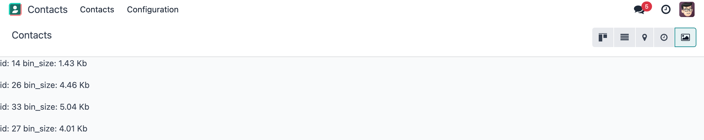
loadImages(domain) {...}method to theGalleryController. It should perform awebSearchReadcall from the orm service to fetch records corresponding to the domain, and useimageFieldreceived in props.If you didn’t include
bin_sizein the context of the call, you will receive the image field encoded in base64. Make sure to putbin_sizein the context to receive the size of the image field. We will display the image later.Modify the
setupcode to call that method in theonWillStartandonWillUpdatePropshooks.Modify the template to display the id and the size of each image inside the default slot of the
Layoutcomponent.
Note
The loading data code will be moved into a proper model in a next exercise.
5. Solve the concurrency problem
For now, our code is not concurrency proof. If one changes the domain twice, it will trigger the
loadImages(domain) twice. We have thus two requests that can arrive at different time depending
on different factors. Receiving the response for the first request after receiving the response
for the second request will lead to an inconsistent state.
The KeepLast primitive from Odoo solves this problem, it manages a list of tasks, and only
keeps the last task active.
Import
KeepLastfrom@web/core/utils/concurrency.Instanciate a
KeepLastobject in the model.Add the
webSearchReadcall in theKeepLastso that only the last call is resolved.
See also
6. Reorganize code
Real views are a little bit more organized. This may be overkill in this example, but it is intended to learn how to structure code in Odoo. Also, this will scale better with changing requirements.
Move all the model code in its own
GalleryModelclass.Move all the rendering code in a
GalleryRenderercomponent.Import
GalleryModelandGalleryRendererinGalleryControllerto make it work.
7. Make the view extensible
To extends the view, one could import the gallery view object to modify it to their taste. The problem is that for the moment, it is not possible to define a custom model or renderer because it is hardcoded in the controller.
Import
GalleryModelandGalleryRendererin the gallery view file.Add a
ModelandRendererkey to the gallery view object and assign them toGalleryModelandGalleryRenderer. PassModelandRendereras props to the controller.Remove the hardcoded import in the controller and get them from the props.
Use t-component to have dynamic sub component.
Note
This is how someone could now extend the gallery view by modifying the renderer:
/** @odoo-module */

import { registry } from '@web/core/registry';
import { galleryView } from '@awesome_gallery/gallery_view';
import { GalleryRenderer } from '@awesome_gallery/gallery_renderer';

export class MyExtendedGalleryRenderer extends GalleryRenderer {
   static template = "my_module.MyExtendedGalleryRenderer";
   setup() {
      super.setup();
      console.log("my gallery renderer extension");
   }
}

registry.category("views").add("my_gallery", {
   ...galleryView,
   Renderer: MyExtendedGalleryRenderer,
});
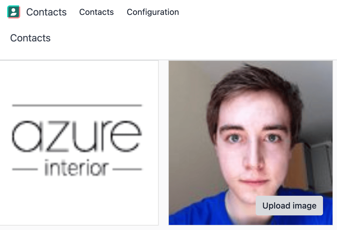
8. Display images
Update the renderer to display images in a nice way, if the field is set. If image_field is
empty, display an empty box instead.
Tip
There is a controller that allows to retrieve an image from a record. You can use this snippet to construct the link:
import { url } from "@web/core/utils/urls";
const url = url("/web/image", {
   model: resModel,
   id: image_id,
   field: imageField,
});

9. Switch to form view on click
Update the renderer to react to a click on an image and switch to a form view. You can use the
switchView function from the action service.
See also
10. Add an optional tooltip
It is useful to have some additional information on mouse hover.
Update the code to allow an optional additional attribute on the arch:
<gallery image_field="some_field" tooltip_field="some_other_field"/>
On mouse hover, display the content of the tooltip field. It should work if the field is a char field, a number field or a many2one field. To put a tooltip to an html element, you can put the string in the
data-tooltipattribute of the element.Update the customer gallery view arch to add the customer as tooltip field.

11. Add pagination
Let’s add a pager on the control panel and manage all the pagination like in a normal Odoo view.

12. Validating views
We have a nice and useful view so far. But in real life, we may have issue with users incorrectly
encoding the arch of their Gallery view: it is currently only an unstructured piece of XML.
Let us add some validation! In Odoo, XML documents can be described with an RN file (Relax NG file), and then validated.
Add an RNG file that describes the current grammar:
A mandatory attribute
image_field.An optional attribute:
tooltip_field.
Add some code to make sure all views are validated against this RNG file.
While we are at it, let us make sure that
image_fieldandtooltip_fieldare fields from the current model.
Since validating an RNG file is not trivial, here is a snippet to help:
# -*- coding: utf-8 -*-
import logging
import os

from lxml import etree

from odoo.loglevels import ustr
from odoo.tools import misc, view_validation

_logger = logging.getLogger(__name__)

_viewname_validator = None

@view_validation.validate('viewname')
def schema_viewname(arch, **kwargs):
      """ Check the gallery view against its schema

      :type arch: etree._Element
      """
      global _viewname_validator

      if _viewname_validator is None:
         with misc.file_open(os.path.join('modulename', 'rng', 'viewname.rng')) as f:
            _viewname_validator = etree.RelaxNG(etree.parse(f))

      if _viewname_validator.validate(arch):
         return True

      for error in _viewname_validator.error_log:
         _logger.error(ustr(error))
      return False
13. Uploading an image
Our gallery view does not allow users to upload images. Let us implement that.
Add a button on each image by using the
FileUploadercomponent.The
FileUploadercomponent accepts theonUploadedprops, which is called when the user uploads an image. Make sure to callwebSavefrom the orm service to upload the new image.You maybe noticed that the image is uploaded but it is not re-rendered by the browser. This is because the image link did not change so the browser do not re-fetch them. Include the
write_datefrom the record to the image url.Make sure that clicking on the upload button does not trigger the switchView.
14. Advanced tooltip template
For now we can only specify a tooltip field. But what if we want to allow to write a specific template for it ?
Example
This is an example of a gallery arch view that should work after this exercise.
<record id="contacts_gallery_view" model="ir.ui.view">
   <field name="name">awesome_gallery.orders.gallery</field>
   <field name="model">res.partner</field>
   <field name="arch" type="xml">
      <gallery image_field="image_1920" tooltip_field="name">
         <field name="email"/> <!-- Specify to the model that email should be fetched -->
         <field name="name"/>  <!-- Specify to the model that name should be fetched -->
         <tooltip-template> <!-- Specify the owl template for the tooltip -->
            <p class="m-0">name: <field name="name"/></p> <!-- field is compiled into a t-esc-->
            <p class="m-0">e-mail: <field name="email"/></p>
         </tooltip-template>
      </gallery>
   </field>
</record>
Replace the
res.partnergallery arch view inawesome_gallery/views/views.xmlwith the arch in example above. Don’t worry if it does not pass the rng validation.Modify the gallery rng validator to accept the new arch structure.
Tip
You can use this rng snippet to validate the tooltip-template tag
<rng:define name="tooltip-template">
   <rng:element name="tooltip-template">
         <rng:zeroOrMore>
            <rng:text/>
            <rng:ref name="any"/>
         </rng:zeroOrMore>
   </rng:element>
</rng:define>

<rng:define name="any">
   <rng:element>
         <rng:anyName/>
         <rng:zeroOrMore>
            <rng:choice>
               <rng:attribute>
                     <rng:anyName/>
               </rng:attribute>
               <rng:text/>
               <rng:ref name="any"/>
            </rng:choice>
         </rng:zeroOrMore>
   </rng:element>
</rng:define>
The arch parser should parse the fields and the tooltip template. Import
visitXMLfrom@web/core/utils/xmland use it to parse field names and the tooltip template.Make sure that the model call the
webSearchReadby including the parsed field names in the specification.The renderer (or any sub-component you created for it) should receive the parsed tooltip template. Manipulate this template to replace the
<field>element into a<t t-esc="x">element.Tip
The template is an
Elementobject so it can be manipulated like a HTML element.Register the template to Owl thanks to the
xmlfunction from@odoo/owl.Use the
useTooltiphook from@web/core/tooltip/tooltip_hookto display the tooltips. This hooks take as argument the Owl template and the variable needed by the template.
